Raging Bulls
Blue Rhinos

Speed Poison

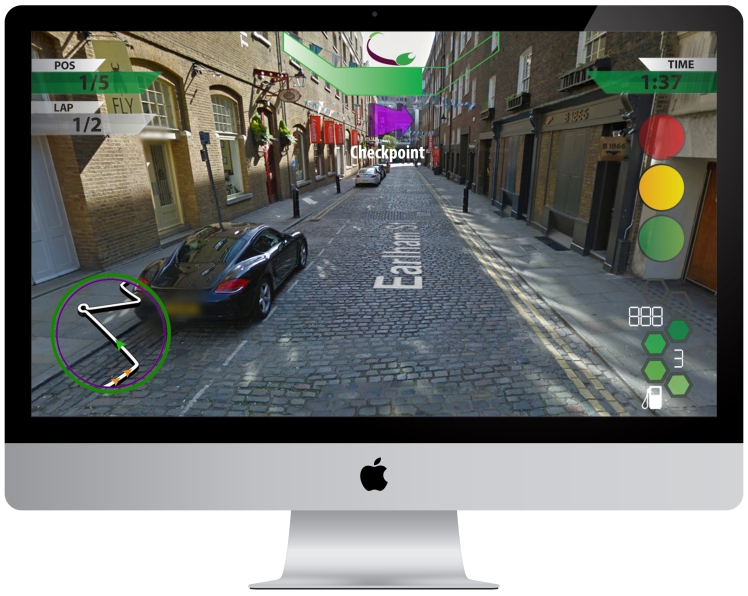
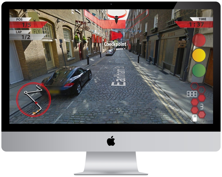
The first team, The Rading Bulls, have a main colour scheme of red with parts of black as the team logo is mostly red. The second team, The Blue Rhinos, have a main colour scheme of blue with parts of yellow and eventhough the logo is mostly yellow, blue is the better choice as it isnt as transparent as yellow which makes the interfaces stand out. The third team, The Speed Poison, has a main colour scheme of green with parts of purple as green is linked more to poison and is the main colour for poison.
I added a circular shaped map on the bottom left to help the player see where they are and where the other cars are. On the bottom left is the speedometer and fuel gauge. The more hexagons are filled in, the more fuel (electricity) the car has but if there is very few hexagons filled, then the fuel of the car is low. Above the speedometer are the start lights, they show the players when the race starts. The lights on the screen are currently on yellow which shows that the players are about to start. Furthermore, at the top of the screen are the team logos; they tell the players what team they are in. Below that is the boost interface; this shows the players how much nitros (boost) they have left. In addition, at the centre of the screen is the arrow. This tell the players where to go as its giving directions to the next turn. The “checkpoint” interface pops up when the checkpoint is near by. Either side of the boost interface are the position and time interfaces. The position interface tells the player what position they are currently in. However, the Time interface tells the player their current time but if they dont get to the checkpoint at a certain time, the timer will start beeping and you will lose the race.
In this assignment, I thought that it was successful as I created 3 different team logos that were simple with a professional look but not too overdone that the player would not be able to recognise what the logo looked like. When looking at images of professional logos from big brands, I realised that they were quite simple with not much going on so it was easily recognisable. Furthermore, this links to the designs of my interfaces as I wanted them to be simple but also look professional. This was achievable with my research as I researched different racing games on console platforms, seeing many different types of interfaces and designs which boosted my imagination. Also, many games have influenced me to create professional looking game interfaces, such as Forza Motor Sport 6. This is because it wasnt too crowded with a lot of UI all over the screen but also not too little with only very few bits of information on the screen. Forza had the perfect amount of information needed for the player with the interface elements were very simple with a clean white texture but at the same time looked very professional; this was one of my goals when creating my interfaces. If I could make the game interface again, I would add more elements to the map, such as an arrow pointing to where the other cars are incase they are right behind the player and the player is trying to block the cars.
Also, most of the interfaces and images in the final piece were all made and captured by me which means that there are no copy right claims in the design. However, the only image I copied from the internet was the fuel gauge, but this was not copy righted so I was able to use it freely. In contrast, if I used images of car companies, such as porche, there could be copy right claims towards it which would not be good for me or the game publisher. Furthermore, In my research, I understood that electric cars work very differently to cars that run on fuel as fast electric cars have very few gears with most having no gears which meant I had to adapt to the interface so I would not need to add many gears and the elements to help power the gears, such as the tachometer. In conclusion, my assignment went well as the game interfaces were simple and they looked professional and the original design and layout was quite close to my final design which was also satisfying.
